將不同縮放器對數據的影響與離群值進行比較?
加利福尼亞住房數據集的特征0(中位數收入)和特征5(家庭數)具有不同的尺度,并包含一些非常大的離群值。這兩個特征導致難以可視化數據,更重要的是,它們會降低許多機器學習算法的預測性能。未縮放的數據也會減慢甚至阻止許多基于梯度的估計器的收斂。
確實,許多估計器的設計假設是每個要素的取值接近零,或更重要的是,所有要素均在可比較的范圍內變化。特別是,基于度量和基于梯度的估算器通常會采用近似標準化的數據(具有單位方差的中心特征)。一個明顯的例外是基于決策樹的估計器,它對數據的任意縮放具有魯棒性。
本示例使用不同的縮放器,轉換器和歸一化器將數據帶入預定義的范圍內。
縮放器是線性(或更精確地說是仿射)變壓器,并且在估計用于移位和縮放每個特征的參數的方式上彼此不同。
QuantileTransformer提供非線性轉換,其中邊緣離群值和離群值之間的距離縮小。 PowerTransformer提供了非線性轉換,其中數據被映射到正態分布,以穩定方差并最小化偏斜度。
與以前的變換不同,歸一化是指每個樣本變換而不是每個特征變換。
以下代碼有點冗長,可以直接跳轉到結果分析。
# 作者:  Raghav RV <rvraghav93@gmail.com>
#       Guillaume Lemaitre <g.lemaitre58@gmail.com>
#       Thomas Unterthiner
# 執照:BSD 3 clause

import numpy as np

import matplotlib as mpl
from matplotlib import pyplot as plt
from matplotlib import cm

from sklearn.preprocessing import MinMaxScaler
from sklearn.preprocessing import minmax_scale
from sklearn.preprocessing import MaxAbsScaler
from sklearn.preprocessing import StandardScaler
from sklearn.preprocessing import RobustScaler
from sklearn.preprocessing import Normalizer
from sklearn.preprocessing import QuantileTransformer
from sklearn.preprocessing import PowerTransformer

from sklearn.datasets import fetch_california_housing

print(__doc__)

dataset = fetch_california_housing()
X_full, y_full = dataset.data, dataset.target

# 僅采用2個特征即可簡化可視化
# 0特征具有長尾分布。
# 特征5有一些但很大的離群值。

X = X_full[:, [0, 5]]

distributions = [
    ('Unscaled data', X),
    ('Data after standard scaling',
        StandardScaler().fit_transform(X)),
    ('Data after min-max scaling',
        MinMaxScaler().fit_transform(X)),
    ('Data after max-abs scaling',
        MaxAbsScaler().fit_transform(X)),
    ('Data after robust scaling',
        RobustScaler(quantile_range=(25, 75)).fit_transform(X)),
    ('Data after power transformation (Yeo-Johnson)',
     PowerTransformer(method='yeo-johnson').fit_transform(X)),
    ('Data after power transformation (Box-Cox)',
     PowerTransformer(method='box-cox').fit_transform(X)),
    ('Data after quantile transformation (gaussian pdf)',
        QuantileTransformer(output_distribution='normal')
        .fit_transform(X)),
    ('Data after quantile transformation (uniform pdf)',
        QuantileTransformer(output_distribution='uniform')
        .fit_transform(X)),
    ('Data after sample-wise L2 normalizing',
        Normalizer().fit_transform(X)),
]

# 將輸出范圍縮放到0到1之間
y = minmax_scale(y_full)

# matplotlib <1.5中不存在plasma列(直譯:血漿那一列)
cmap = getattr(cm, 'plasma_r', cm.hot_r)

def create_axes(title, figsize=(16, 6)):
    fig = plt.figure(figsize=figsize)
    fig.suptitle(title)

    # 定義第一個繪圖的軸
    left, width = 0.1, 0.22
    bottom, height = 0.1, 0.7
    bottom_h = height + 0.15
    left_h = left + width + 0.02

    rect_scatter = [left, bottom, width, height]
    rect_histx = [left, bottom_h, width, 0.1]
    rect_histy = [left_h, bottom, 0.05, height]

    ax_scatter = plt.axes(rect_scatter)
    ax_histx = plt.axes(rect_histx)
    ax_histy = plt.axes(rect_histy)

    # 定義放大圖的軸
    left = width + left + 0.2
    left_h = left + width + 0.02

    rect_scatter = [left, bottom, width, height]
    rect_histx = [left, bottom_h, width, 0.1]
    rect_histy = [left_h, bottom, 0.05, height]

    ax_scatter_zoom = plt.axes(rect_scatter)
    ax_histx_zoom = plt.axes(rect_histx)
    ax_histy_zoom = plt.axes(rect_histy)

    # 定義顏色條的軸
    left, width = width + left + 0.13, 0.01

    rect_colorbar = [left, bottom, width, height]
    ax_colorbar = plt.axes(rect_colorbar)

    return ((ax_scatter, ax_histy, ax_histx),
            (ax_scatter_zoom, ax_histy_zoom, ax_histx_zoom),
            ax_colorbar)


def plot_distribution(axes, X, y, hist_nbins=50, title="",
                      x0_label="", x1_label=""):
    ax, hist_X1, hist_X0 = axes

    ax.set_title(title)
    ax.set_xlabel(x0_label)
    ax.set_ylabel(x1_label)

    # 點狀圖
    colors = cmap(y)
    ax.scatter(X[:, 0], X[:, 1], alpha=0.5, marker='o', s=5, lw=0, c=colors)

 # 移除頂部和右側脊柱以達到美觀
    # 制作漂亮的軸布局
    ax.spines['top'].set_visible(False)
    ax.spines['right'].set_visible(False)
    ax.get_xaxis().tick_bottom()
    ax.get_yaxis().tick_left()
    ax.spines['left'].set_position(('outward', 10))
    ax.spines['bottom'].set_position(('outward', 10))

    # 軸X1的直方圖(功能5)
    hist_X1.set_ylim(ax.get_ylim())
    hist_X1.hist(X[:, 1], bins=hist_nbins, orientation='horizontal',
                 color='grey', ec='grey')
    hist_X1.axis('off')

    # 軸X0的直方圖(功能0)
    hist_X0.set_xlim(ax.get_xlim())
    hist_X0.hist(X[:, 0], bins=hist_nbins, orientation='vertical',
                 color='grey', ec='grey')
    hist_X0.axis('off')
每個定標器/歸一化器/變壓器將顯示兩個圖。 左圖將顯示完整數據集的散布圖,而右圖將僅考慮數據集的99%排除極值,不包括邊緣異常值。 此外,每個特征的邊際分布將顯示在散點圖的側面。
def make_plot(item_idx):
    title, X = distributions[item_idx]
    ax_zoom_out, ax_zoom_in, ax_colorbar = create_axes(title)
    axarr = (ax_zoom_out, ax_zoom_in)
    plot_distribution(axarr[0], X, y, hist_nbins=200,
                      x0_label="Median Income",
                      x1_label="Number of households",
                      title="Full data")

    # 放縮
    zoom_in_percentile_range = (0, 99)
    cutoffs_X0 = np.percentile(X[:, 0], zoom_in_percentile_range)
    cutoffs_X1 = np.percentile(X[:, 1], zoom_in_percentile_range)

    non_outliers_mask = (
        np.all(X > [cutoffs_X0[0], cutoffs_X1[0]], axis=1) &
        np.all(X < [cutoffs_X0[1], cutoffs_X1[1]], axis=1))
    plot_distribution(axarr[1], X[non_outliers_mask], y[non_outliers_mask],
                      hist_nbins=50,
                      x0_label="Median Income",
                      x1_label="Number of households",
                      title="Zoom-in")

    norm = mpl.colors.Normalize(y_full.min(), y_full.max())
    mpl.colorbar.ColorbarBase(ax_colorbar, cmap=cmap,
                              norm=norm, orientation='vertical',
                              label='Color mapping for values of y')
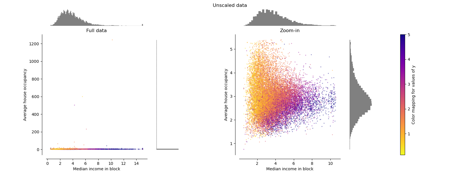
原始數據 Original Data
繪制每個變換以顯示兩個變換后的特征,左圖顯示整個數據集,右圖放大以顯示沒有邊緣異常值的數據集。 大部分樣本被壓縮到特定范圍,中位數收入為[0,10],家庭數量為[0,6]。 請注意,有一些邊緣異常值(一些街區有1200多個家庭)。 因此,取決于應用,特定的預處理可能會非常有益。 在下文中,我們介紹了在存在邊緣異常值的情況下這些預處理方法的一些見解和行為。
make_plot(0)
標準縮放器 Standard Scaler
StandardScaler去除均值并將數據縮放為單位方差。 但是,異常值在計算經驗均值和標準偏差時會產生影響,這會縮小特征值的范圍,如下圖左圖所示。 特別要注意的是,由于每個要素的離群值具有不同的大小,因此每個要素上的轉換數據的分布差異很大:大多數數據位于轉換后的中位數收入要素的[-2,4]范圍內,而相同 對于轉換后的家庭數,數據被壓縮在較小的[-0.2,0.2]范圍內。
因此,在存在異常值的情況下,StandardScaler無法保證平衡的要素比例。
make_plot(1)

極值縮放器 MinMaxScaler
MinMaxScaler重新縮放數據集,以使所有要素值都在[0,1]范圍內,如下右面板所示。 但是,對于換算后的家庭數,此縮放將所有inlier壓縮在較窄的范圍[0,0.005]中。
作為StandardScaler,MinMaxScaler對異常值的存在非常敏感。
make_plot(2)

最大絕對值縮放器 MaxAbsScaler
MaxAbsScaler與以前的縮放器不同,因此絕對值映射在[0,1]范圍內。 在僅正數數據上,此縮放器的行為類似于MinMaxScaler,因此也存在較大的異常值。
make_plot(3)

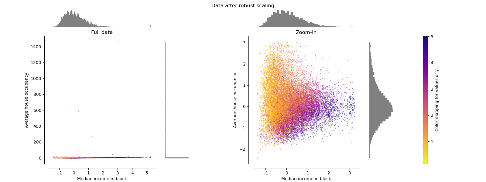
魯棒縮放器 RobustScaler
與以前的縮放器不同,此縮放器的居中和縮放統計信息基于百分位數,因此不受少數幾個非常大的邊緣異常值的影響。 因此,轉換后的特征值的結果范圍比以前的縮放器大,并且更重要的是,近似相似:對于兩個特征,大多數縮放后的值都在[-2,3]范圍內,如縮放 在圖中。 注意,異常值本身仍然存在于轉換后的數據中。 如果需要單獨的離群裁剪,則需要進行非線性變換(請參見下文)。
make_plot(4)
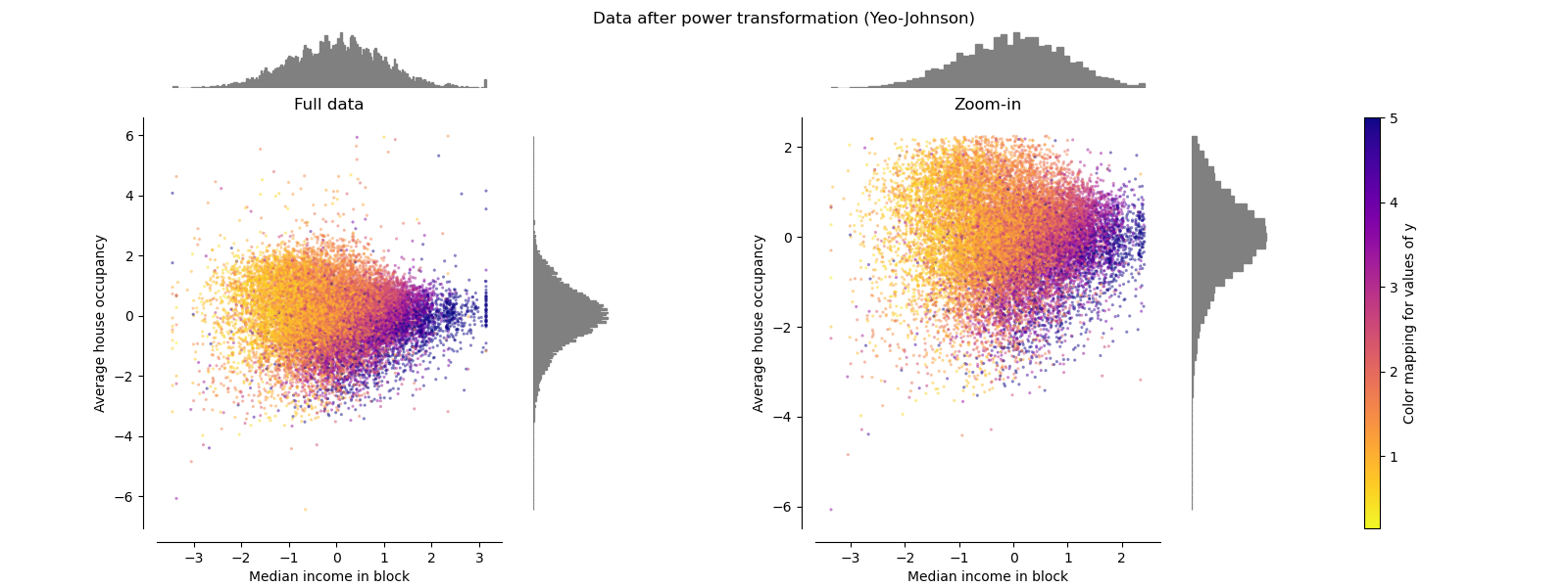
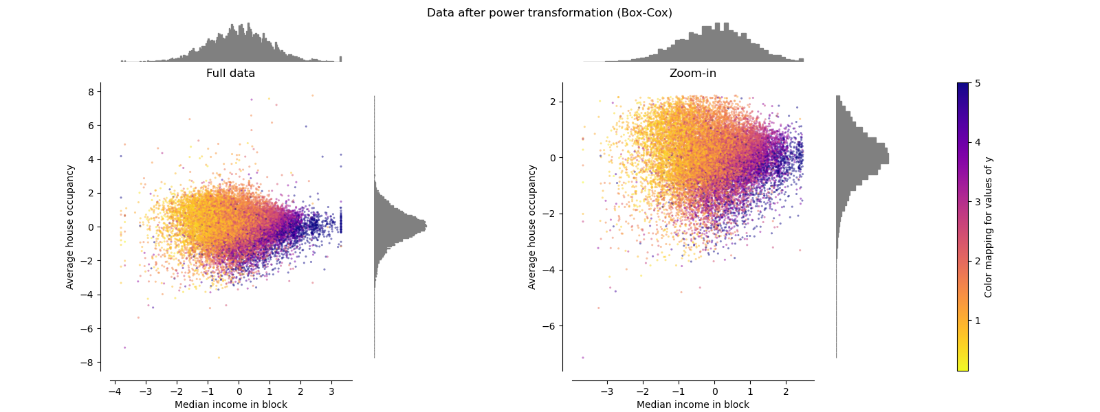
冪轉換器 PowerTransformer
PowerTransformer對每個功能都進行功率轉換,以使數據更像高斯型。 當前,PowerTransformer實現了Yeo-Johnson和Box-Cox轉換。 冪變換找到最佳縮放因子,以通過最大似然估計來穩定方差并最小化偏斜度。 默認情況下,PowerTransformer還將零均值,單位方差歸一化應用于轉換后的輸出。 請注意,Box-Cox只能應用于嚴格的正數據。 收入和家庭數恰好嚴格為正,但是如果存在負值,則應采用Yeo-Johnson轉換。
make_plot(5)
make_plot(6)
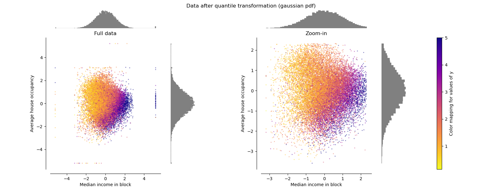
分位數轉化器(高斯) QuantileTransformer(Gaussian)
QuantileTransformer具有附加的output_distribution參數,該參數允許匹配高斯分布而不是均勻分布。 請注意,此非參量轉換器會引入飽和偽像以獲得極值。
make_plot(7)
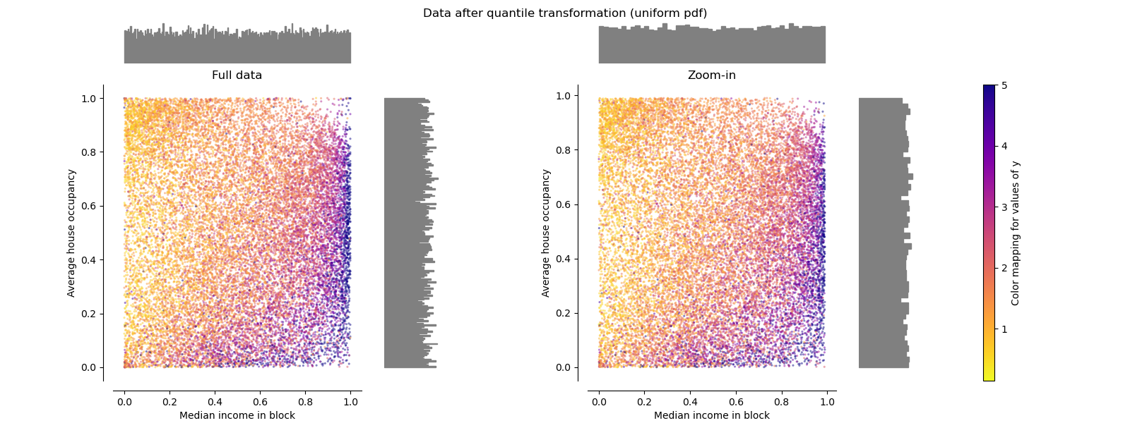
分位數轉化器(均勻) QuantileTransformer(uniform)
QuantileTransformer應用非線性變換,以便將每個特征的概率密度函數映射到均勻分布。 在這種情況下,所有數據都將被映射在[0,1]范圍內,甚至是無法再與離群值區分開的離群值。
作為RobustScaler,QuantileTransformer對異常值具有魯棒性,因為在訓練集中添加或刪除異常值將對保留的數據產生大致相同的變換。 但是與RobustScaler相反,QuantileTransformer還將通過將它們設置為事先定義的范圍邊界(0和1)來自動折疊任何異常值。
make_plot(8)
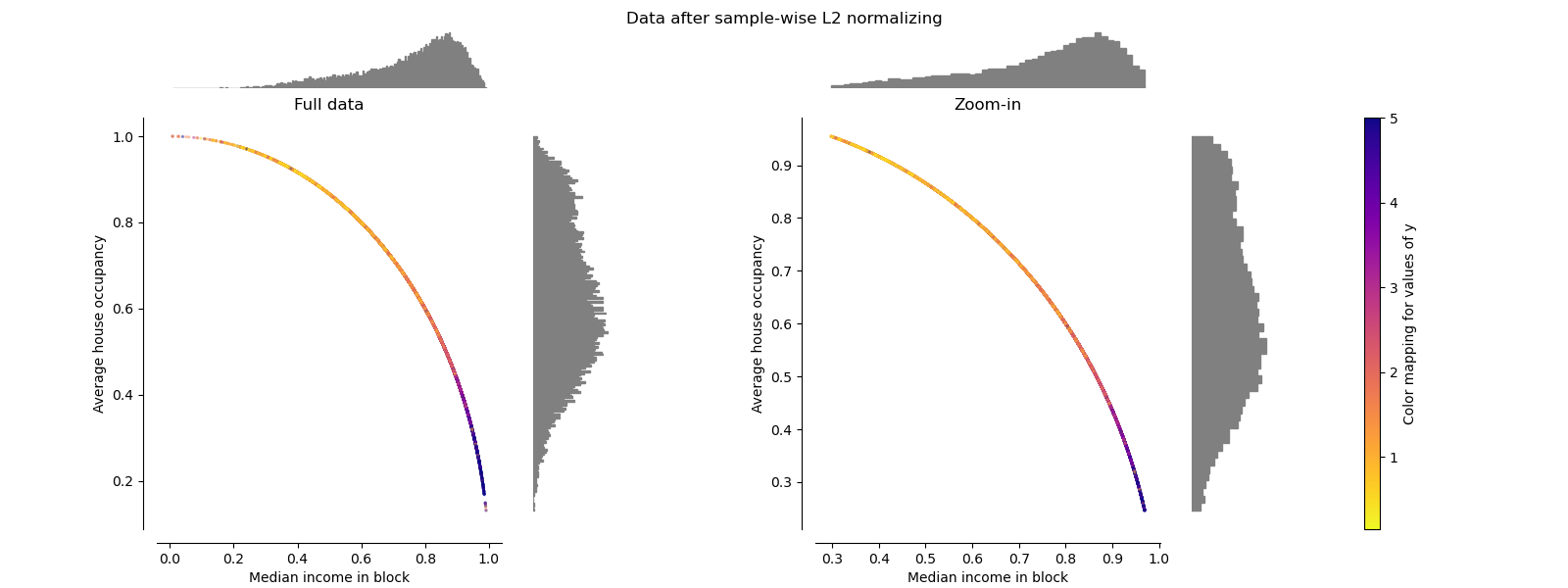
歸一化 Normalizer
歸一化器將每個樣本的向量重新縮放為具有單位范數,而與樣本的分布無關。 在下面的兩個圖中都可以看到,其中所有樣本都映射到單位圓上。 在我們的示例中,兩個選定的特征僅具有正值。 因此,轉換后的數據僅位于正象限中。 如果某些原始特征混合了正值和負值,則情況并非如此。
make_plot(9)
腳本的總運行時間:(0分鐘10.606秒)