最近鄰質心分類?
最近質心分類的樣本用法。 本案例將繪制每個類別的決策邊界。
輸出:
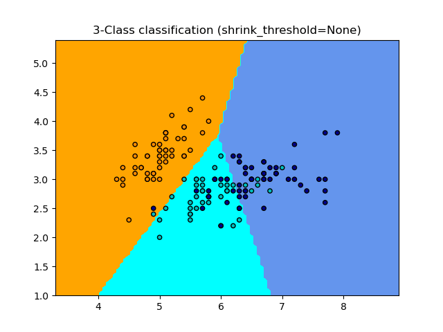
None 0.8133333333333334
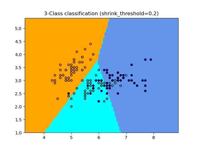
0.2 0.82
輸入:
print(__doc__)

import numpy as np
import matplotlib.pyplot as plt
from matplotlib.colors import ListedColormap
from sklearn import datasets
from sklearn.neighbors import NearestCentroid

n_neighbors = 15

# 導入需要處理的數據
iris = datasets.load_iris()
# 我們僅采用前兩個特征。我們可以通過使用二維數據集來避免使用復雜的切片
X = iris.data[:, :2]
y = iris.target

h = .02  # 設置網格中的步長

# 提取色譜
cmap_light = ListedColormap(['orange', 'cyan', 'cornflowerblue'])
cmap_bold = ListedColormap(['darkorange', 'c', 'darkblue'])

for shrinkage in [None, .2]:
    # 我們創建最近鄰分類器的實例并擬合數據。
    clf = NearestCentroid(shrink_threshold=shrinkage)
    clf.fit(X, y)
    y_pred = clf.predict(X)
    print(shrinkage, np.mean(y == y_pred))
    # 繪制決策邊界。為此,我們將為網格[x_min,x_max] x [y_min,y_max]中的每個點分配顏色。
    x_min, x_max = X[:, 0].min() - 1, X[:, 0].max() + 1
    y_min, y_max = X[:, 1].min() - 1, X[:, 1].max() + 1
    xx, yy = np.meshgrid(np.arange(x_min, x_max, h),
                         np.arange(y_min, y_max, h))
    Z = clf.predict(np.c_[xx.ravel(), yy.ravel()])

    # 將結果放入顏色圖
    Z = Z.reshape(xx.shape)
    plt.figure()
    plt.pcolormesh(xx, yy, Z, cmap=cmap_light)

    # 繪制訓練數據
    plt.scatter(X[:, 0], X[:, 1], c=y, cmap=cmap_bold,
                edgecolor='k', s=20)
    plt.title("3-Class classification (shrink_threshold=%r)"
              % shrinkage)
    plt.axis('tight')

plt.show()
腳本的總運行時間:(0分鐘0.245秒)