簡單的1維內核密度估計?
本示例使用sklearn.neighbors.KernelDensity類在一個維度上演示核密度估計的原理。
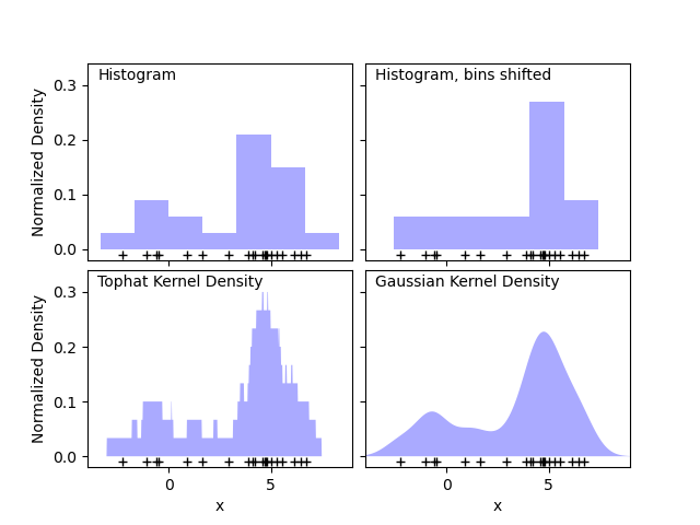
第一張圖顯示了使用直方圖可視化一維點密度的問題之一。從直覺上講,直方圖可以看作是一種方案,其中將“塊”單元堆疊在規則網格的每個點上方。但是,如前兩個面板所示,這些塊的網格選擇可能導致有關密度分布的基本形狀的想法大相徑庭。如果我們改為將每個塊放在其表示的點上居中,則得到的估計值將顯示在左下方的面板中。這是使用“高頂禮帽”(top hat)核的內核密度估計。這個想法可以推廣到其他核:第一個圖的右下圖顯示了在相同分布上的高斯核密度估計。
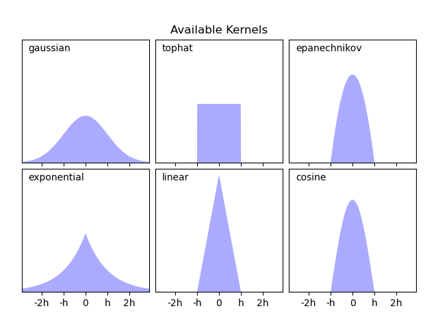
Scikit-learn通過sklearn.neighbors.KernelDensity估計器,使用Ball Tree或KD Tree結構實現了有效的內核密度估計。可用的核在本案例的第二張圖中顯示。
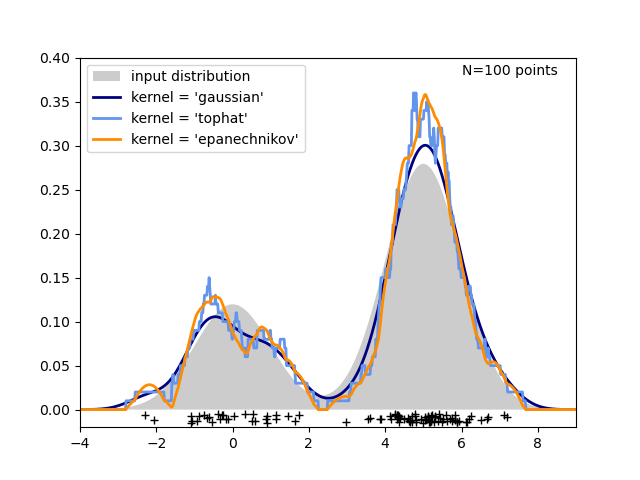
第三張圖比較了在一維中分布100個樣本的核密度估計。盡管此示例使用一維分布,但內核密度估計也可以輕松有效地擴展到更高的維度。
輸入:
# 作者: Jake Vanderplas <jakevdp@cs.washington.edu>
#
import numpy as np
import matplotlib
import matplotlib.pyplot as plt
from distutils.version import LooseVersion
from scipy.stats import norm
from sklearn.neighbors import KernelDensity

# 在直方圖中`normed`選項已經被棄用,現在更傾向于`density`
if LooseVersion(matplotlib.__version__) >= '2.1':
    density_param = {'density': True}
else:
    density_param = {'normed': True}

# ----------------------------------------------------------------------
# 繪制直方圖到核的過程
np.random.seed(1)
N = 20
X = np.concatenate((np.random.normal(0, 1, int(0.3 * N)),
                    np.random.normal(5, 1, int(0.7 * N))))[:, np.newaxis]
X_plot = np.linspace(-5, 10, 1000)[:, np.newaxis]
bins = np.linspace(-5, 10, 10)

fig, ax = plt.subplots(2, 2, sharex=True, sharey=True)
fig.subplots_adjust(hspace=0.05, wspace=0.05)

# 直方圖1
ax[0, 0].hist(X[:, 0], bins=bins, fc='#AAAAFF', **density_param)
ax[0, 0].text(-3.5, 0.31, "Histogram")

# 直方圖2
ax[0, 1].hist(X[:, 0], bins=bins + 0.75, fc='#AAAAFF', **density_param)
ax[0, 1].text(-3.5, 0.31, "Histogram, bins shifted")

# 高禮帽核密度估計
kde = KernelDensity(kernel='tophat', bandwidth=0.75).fit(X)
log_dens = kde.score_samples(X_plot)
ax[1, 0].fill(X_plot[:, 0], np.exp(log_dens), fc='#AAAAFF')
ax[1, 0].text(-3.5, 0.31, "Tophat Kernel Density")

# 高斯核密度估計
kde = KernelDensity(kernel='gaussian', bandwidth=0.75).fit(X)
log_dens = kde.score_samples(X_plot)
ax[1, 1].fill(X_plot[:, 0], np.exp(log_dens), fc='#AAAAFF')
ax[1, 1].text(-3.5, 0.31, "Gaussian Kernel Density")

for axi in ax.ravel():
    axi.plot(X[:, 0], np.full(X.shape[0], -0.01), '+k')
    axi.set_xlim(-4, 9)
    axi.set_ylim(-0.02, 0.34)

for axi in ax[:, 0]:
    axi.set_ylabel('Normalized Density')

for axi in ax[1, :]:
    axi.set_xlabel('x')

# ----------------------------------------------------------------------
# 繪制所有可能的核函數
X_plot = np.linspace(-6, 6, 1000)[:, None]
X_src = np.zeros((1, 1))

fig, ax = plt.subplots(2, 3, sharex=True, sharey=True)
fig.subplots_adjust(left=0.05, right=0.95, hspace=0.05, wspace=0.05)


def format_func(x, loc):
    if x == 0:
        return '0'
    elif x == 1:
        return 'h'
    elif x == -1:
        return '-h'
    else:
        return '%ih' % x

for i, kernel in enumerate(['gaussian', 'tophat', 'epanechnikov',
                            'exponential', 'linear', 'cosine']):
    axi = ax.ravel()[i]
    log_dens = KernelDensity(kernel=kernel).fit(X_src).score_samples(X_plot)
    axi.fill(X_plot[:, 0], np.exp(log_dens), '-k', fc='#AAAAFF')
    axi.text(-2.6, 0.95, kernel)

    axi.xaxis.set_major_formatter(plt.FuncFormatter(format_func))
    axi.xaxis.set_major_locator(plt.MultipleLocator(1))
    axi.yaxis.set_major_locator(plt.NullLocator())

    axi.set_ylim(0, 1.05)
    axi.set_xlim(-2.9, 2.9)

ax[0, 1].set_title('Available Kernels')

# ----------------------------------------------------------------------
# 繪制一維密度評估的例子
N = 100
np.random.seed(1)
X = np.concatenate((np.random.normal(0, 1, int(0.3 * N)),
                    np.random.normal(5, 1, int(0.7 * N))))[:, np.newaxis]

X_plot = np.linspace(-5, 10, 1000)[:, np.newaxis]

true_dens = (0.3 * norm(0, 1).pdf(X_plot[:, 0])
             + 0.7 * norm(5, 1).pdf(X_plot[:, 0]))

fig, ax = plt.subplots()
ax.fill(X_plot[:, 0], true_dens, fc='black', alpha=0.2,
        label='input distribution')
colors = ['navy', 'cornflowerblue', 'darkorange']
kernels = ['gaussian', 'tophat', 'epanechnikov']
lw = 2

for color, kernel in zip(colors, kernels):
    kde = KernelDensity(kernel=kernel, bandwidth=0.5).fit(X)
    log_dens = kde.score_samples(X_plot)
    ax.plot(X_plot[:, 0], np.exp(log_dens), color=color, lw=lw,
            linestyle='-', label="kernel = '{0}'".format(kernel))

ax.text(6, 0.38, "N={0} points".format(N))

ax.legend(loc='upper left')
ax.plot(X[:, 0], -0.005 - 0.01 * np.random.random(X.shape[0]), '+k')

ax.set_xlim(-4, 9)
ax.set_ylim(-0.02, 0.4)
plt.show()
腳本的總運行時間:(0分鐘0.620秒)