真實數據集上的孤立點檢測?
此示例說明了對實際數據集進行穩健協方差估計的必要性。它對孤立點檢測和更好地理解數據結構都是有用的。
我們從波士頓住房數據集中選擇了兩組兩個變量,以說明使用幾個孤立點檢測工具可以進行什么樣的分析。為了可視化的目的,我們使用了二維的例子,但是我們應該意識到,在高維中,事情并不像我們將要指出的那樣簡單。
在下面的兩個例子中,主要的結果是經驗協方差估計作為一種非穩健的估計,受觀測的非均勻結構的影響很大。雖然穩健協方差估計能夠集中于數據分布的主要模式,但它堅持了數據應該是高斯分布的假設,得到了一些對數據結構的有偏估計,但在一定程度上也是準確的。單類支持向量機不假設任何參數形式的數據分布,因此可以更好地模擬數據的復雜形狀。
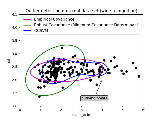
第一個例子
第一個例子說明了當存在離群點時,最小協方差行列式穩健估計器如何幫助集中于相關的聚類。這里,經驗協方差估計被主聚類以外的點所扭曲。當然,一些篩選工具會指出存在兩個聚類(支持向量機、高斯混合模型、單變量孤立點檢測、…)。但如果這是一個高維的例子,這些都不可能那么容易應用。
print(__doc__)

# Author: Virgile Fritsch <virgile.fritsch@inria.fr>
# License: BSD 3 clause

import numpy as np
from sklearn.covariance import EllipticEnvelope
from sklearn.svm import OneClassSVM
import matplotlib.pyplot as plt
import matplotlib.font_manager
from sklearn.datasets import load_wine

# Define "classifiers" to be used
classifiers = {
    "Empirical Covariance": EllipticEnvelope(support_fraction=1.,
                                             contamination=0.25),
    "Robust Covariance (Minimum Covariance Determinant)":
    EllipticEnvelope(contamination=0.25),
    "OCSVM": OneClassSVM(nu=0.25, gamma=0.35)}
colors = ['m', 'g', 'b']
legend1 = {}
legend2 = {}

# Get data
X1 = load_wine()['data'][:, [1, 2]]  # two clusters

# Learn a frontier for outlier detection with several classifiers
xx1, yy1 = np.meshgrid(np.linspace(0, 6, 500), np.linspace(1, 4.5, 500))
for i, (clf_name, clf) in enumerate(classifiers.items()):
    plt.figure(1)
    clf.fit(X1)
    Z1 = clf.decision_function(np.c_[xx1.ravel(), yy1.ravel()])
    Z1 = Z1.reshape(xx1.shape)
    legend1[clf_name] = plt.contour(
        xx1, yy1, Z1, levels=[0], linewidths=2, colors=colors[i])

legend1_values_list = list(legend1.values())
legend1_keys_list = list(legend1.keys())

# Plot the results (= shape of the data points cloud)
plt.figure(1)  # two clusters
plt.title("Outlier detection on a real data set (wine recognition)")
plt.scatter(X1[:, 0], X1[:, 1], color='black')
bbox_args = dict(boxstyle="round", fc="0.8")
arrow_args = dict(arrowstyle="->")
plt.annotate("outlying points", xy=(4, 2),
             xycoords="data", textcoords="data",
             xytext=(3, 1.25), bbox=bbox_args, arrowprops=arrow_args)
plt.xlim((xx1.min(), xx1.max()))
plt.ylim((yy1.min(), yy1.max()))
plt.legend((legend1_values_list[0].collections[0],
            legend1_values_list[1].collections[0],
            legend1_values_list[2].collections[0]),
           (legend1_keys_list[0], legend1_keys_list[1], legend1_keys_list[2]),
           loc="upper center",
           prop=matplotlib.font_manager.FontProperties(size=11))
plt.ylabel("ash")
plt.xlabel("malic_acid")

plt.show()
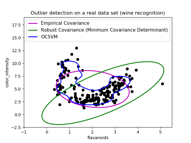
第二個例子
第二個例子顯示了協方差的最小協方差行列式穩健估計器能夠集中于數據分布的主要模式:局部似乎被很好地估計,盡管由于香蕉形狀的分布,協方差很難估計。總之,我們可以去掉一些外圍的觀測點。一類支持向量機能夠捕捉到真實的數據結構,但其難點在于調整其核帶寬參數,從而使數據點矩陣的形狀與數據過度擬合的風險得到很好的控制。
# Get data
X2 = load_wine()['data'][:, [6, 9]]  # "banana"-shaped

# Learn a frontier for outlier detection with several classifiers
xx2, yy2 = np.meshgrid(np.linspace(-1, 5.5, 500), np.linspace(-2.5, 19, 500))
for i, (clf_name, clf) in enumerate(classifiers.items()):
    plt.figure(2)
    clf.fit(X2)
    Z2 = clf.decision_function(np.c_[xx2.ravel(), yy2.ravel()])
    Z2 = Z2.reshape(xx2.shape)
    legend2[clf_name] = plt.contour(
        xx2, yy2, Z2, levels=[0], linewidths=2, colors=colors[i])

legend2_values_list = list(legend2.values())
legend2_keys_list = list(legend2.keys())

# Plot the results (= shape of the data points cloud)
plt.figure(2)  # "banana" shape
plt.title("Outlier detection on a real data set (wine recognition)")
plt.scatter(X2[:, 0], X2[:, 1], color='black')
plt.xlim((xx2.min(), xx2.max()))
plt.ylim((yy2.min(), yy2.max()))
plt.legend((legend2_values_list[0].collections[0],
            legend2_values_list[1].collections[0],
            legend2_values_list[2].collections[0]),
           (legend2_keys_list[0], legend2_keys_list[1], legend2_keys_list[2]),
           loc="upper center",
           prop=matplotlib.font_manager.FontProperties(size=11))
plt.ylabel("color_intensity")
plt.xlabel("flavanoids")

plt.show()
 腳本的總運行時間:(0分1.259秒)
Download Python source code: plot_outlier_detection_wine.py
Download Jupyter notebook: plot_outlier_detection_wine.ipynb