泊松回歸與非正常損失?
此示例說明了在法國電機第三方責任索賠數據集[1]中使用對數線性泊松回歸的方法,并將其與普通最小二乘誤差的線性模型和具有泊松損失(和日志鏈接)的非線性GBRT模型進行了比較。
一些定義:
保單是保險公司和個人之間的合同:投保人,也就是在這種情況下的車輛司機。 索賠是指投保人向保險公司提出的賠償保險損失的請求。 風險敞口是以年數為單位的某一特定保單的保險承保期限。 索賠頻率是索賠的數量除以風險,通常以每年的索賠件數來衡量。
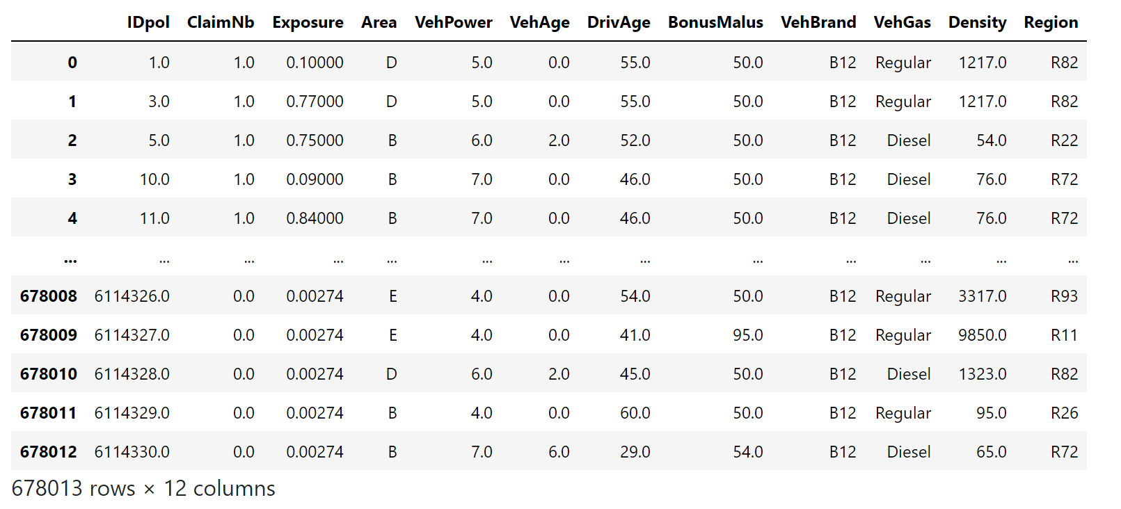
在此數據集中,每個示例對應于保險單。可用的特征包括駕駛年齡,車輛年齡,車輛動力等。
我們的目標是根據歷史數據預測新投保人在車禍后索賠的預期頻率。
1 A. Noll, R. Salzmann and M.V. Wuthrich, Case Study: French Motor Third-Party Liability Claims (November 8, 2018). doi:10.2139/ssrn.3164764
print(__doc__)
# Authors: Christian Lorentzen <lorentzen.ch@gmail.com>
#          Roman Yurchak <rth.yurchak@gmail.com>
#          Olivier Grisel <olivier.grisel@ensta.org>
# License: BSD 3 clause
import numpy as np
import matplotlib.pyplot as plt
import pandas as pd
法國汽車第三方責任索賠數據集
讓我們從OpenML加載motor claim數據集:https://www.openml.org/d/41214
from sklearn.datasets import fetch_openml


df = fetch_openml(data_id=41214, as_frame=True).frame
df
/home/circleci/project/sklearn/datasets/_openml.py:754: UserWarning: Version 1 of dataset freMTPL2freq is inactive, meaning that issues have been found in the dataset. Try using a newer version from this URL: https://www.openml.org/data/v1/download/20649148/freMTPL2freq.arff
  warn("Version {} of dataset {} is inactive, meaning that issues have "
 索賠數量(
索賠數量(ClaimNb)是一個正整數,可以建模為泊松分布。然后假定為在給定時間間隔內以恒定速率發生的離散事件的數量(Exposure,以年為單位)。
在這里,我們要通過一個(尺度)泊松分布來模擬頻率 y = ClaimNb / Exposure 在X上的條件,并以 Exposure 作為sample_weight。
df["Frequency"] = df["ClaimNb"] / df["Exposure"]

print("Average Frequency = {}"
      .format(np.average(df["Frequency"], weights=df["Exposure"])))

print("Fraction of exposure with zero claims = {0:.1%}"
      .format(df.loc[df["ClaimNb"] == 0, "Exposure"].sum() /
              df["Exposure"].sum()))

fig, (ax0, ax1, ax2) = plt.subplots(ncols=3, figsize=(16, 4))
ax0.set_title("Number of claims")
_ = df["ClaimNb"].hist(bins=30, log=True, ax=ax0)
ax1.set_title("Exposure in years")
_ = df["Exposure"].hist(bins=30, log=True, ax=ax1)
ax2.set_title("Frequency (number of claims per year)")
_ = df["Frequency"].hist(bins=30, log=True, ax=ax2)
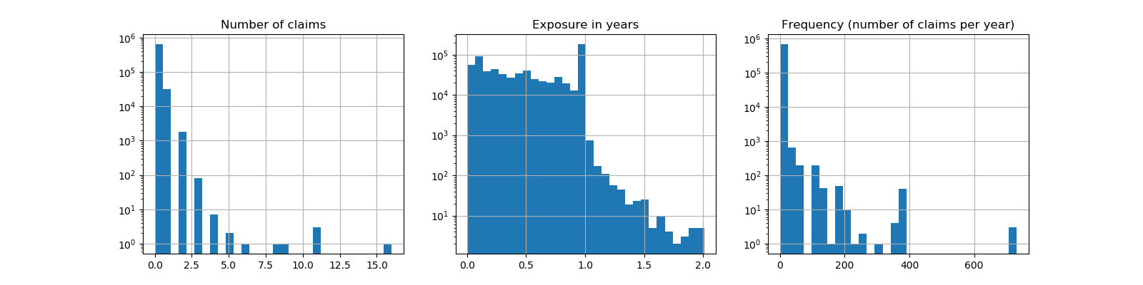
Average Frequency = 0.10070308464041304
Fraction of exposure with zero claims = 93.9%
其余的列可用于預測索賠事件的發生頻率。這些列是非常異構的,具有不同比例的分類變量和數值變量的混合,可能分布非常不均勻。
因此,為了使線性模型與這些預測器相匹配,有必要執行以下標準特征轉換:
from sklearn.pipeline import make_pipeline
from sklearn.preprocessing import FunctionTransformer, OneHotEncoder
from sklearn.preprocessing import StandardScaler, KBinsDiscretizer
from sklearn.compose import ColumnTransformer


log_scale_transformer = make_pipeline(
    FunctionTransformer(np.log, validate=False),
    StandardScaler()
)

linear_model_preprocessor = ColumnTransformer(
    [
        ("passthrough_numeric", "passthrough",
            ["BonusMalus"]),
        ("binned_numeric", KBinsDiscretizer(n_bins=10),
            ["VehAge", "DrivAge"]),
        ("log_scaled_numeric", log_scale_transformer,
            ["Density"]),
        ("onehot_categorical", OneHotEncoder(),
            ["VehBrand", "VehPower", "VehGas", "Region", "Area"]),
    ],
    remainder="drop",
)
恒定預測基線
值得注意的是,超過93%的投保人是沒有索賠的。如果我們把這個問題轉化為一個二分類任務,它顯然是不平衡的,即使是一個簡單的只預測均值的模型也能達到93%的精度。
為了評估使用的指標的相關性,我們將把一個“虛擬”估計器作為基線,它不斷地預測訓練樣本的平均頻率。
from sklearn.dummy import DummyRegressor
from sklearn.pipeline import Pipeline
from sklearn.model_selection import train_test_split

df_train, df_test = train_test_split(df, test_size=0.33, random_state=0)

dummy = Pipeline([
    ("preprocessor", linear_model_preprocessor),
    ("regressor", DummyRegressor(strategy='mean')),
]).fit(df_train, df_train["Frequency"],
       regressor__sample_weight=df_train["Exposure"])
讓我們用3種不同的回歸度量來計算這個恒定預測基線的性能:
from sklearn.metrics import mean_squared_error
from sklearn.metrics import mean_absolute_error
from sklearn.metrics import mean_poisson_deviance


def score_estimator(estimator, df_test):
    """Score an estimator on the test set."""
    y_pred = estimator.predict(df_test)

    print("MSE: %.3f" %
          mean_squared_error(df_test["Frequency"], y_pred,
                             sample_weight=df_test["Exposure"]))
    print("MAE: %.3f" %
          mean_absolute_error(df_test["Frequency"], y_pred,
                              sample_weight=df_test["Exposure"]))

    # Ignore non-positive predictions, as they are invalid for
    # the Poisson deviance.
    mask = y_pred > 0
    if (~mask).any():
        n_masked, n_samples = (~mask).sum(), mask.shape[0]
        print(f"WARNING: Estimator yields invalid, non-positive predictions "
              f" for {n_masked} samples out of {n_samples}. These predictions "
              f"are ignored when computing the Poisson deviance.")

    print("mean Poisson deviance: %.3f" %
          mean_poisson_deviance(df_test["Frequency"][mask],
                                y_pred[mask],
                                sample_weight=df_test["Exposure"][mask]))


print("Constant mean frequency evaluation:")
score_estimator(dummy, df_test)
Constant mean frequency evaluation:
MSE: 0.564
MAE: 0.189
mean Poisson deviance: 0.625
(廣義)線性模型
我們首先用(L2懲罰的)最小二乘線性回歸模型對目標變量進行建模,這一模型被稱為嶺回歸(Ridge回歸)。我們使用一個低懲罰 alpha,因為我們料想這樣的線性模型不適合在如此大的數據集。
from sklearn.linear_model import Ridge


ridge_glm = Pipeline([
    ("preprocessor", linear_model_preprocessor),
    ("regressor", Ridge(alpha=1e-6)),
]).fit(df_train, df_train["Frequency"],
       regressor__sample_weight=df_train["Exposure"])
泊松偏差不能用模型預測的非正值來計算。對于返回一些非正預測(如嶺回歸)的模型,我們忽略相應的樣本,這意味著所獲得的泊松偏差是近似的。另一種方法是使用TransformedTargetRegressor元估計器將y_pred映射到嚴格正域。
print("Ridge evaluation:")
score_estimator(ridge_glm, df_test)
Ridge evaluation:
MSE: 0.560
MAE: 0.177
WARNING: Estimator yields invalid, non-positive predictions  for 1315 samples out of 223745. These predictions are ignored when computing the Poisson deviance.
mean Poisson deviance: 0.601
接下來,我們對目標變量上擬合Poisson回歸。
我們將正則化強度 alpha 設為樣本數(1e-12)上的約1e-6,以模擬L2懲罰項與樣本數不同的嶺回歸。
由于Poisson回歸器內部模擬的是期望目標值的對數,而不是直接的期望值(log vs identity link function),所以X和y之間的關系不再完全是線性的.因此,Poisson回歸被稱為廣義線性模型(GLM),而不是嶺回歸的一般線性模型。
from sklearn.linear_model import PoissonRegressor

n_samples = df_train.shape[0]

poisson_glm = Pipeline([
    ("preprocessor", linear_model_preprocessor),
    ("regressor", PoissonRegressor(alpha=1e-12, max_iter=300))
])
poisson_glm.fit(df_train, df_train["Frequency"],
                regressor__sample_weight=df_train["Exposure"])

print("PoissonRegressor evaluation:")
score_estimator(poisson_glm, df_test)
PoissonRegressor evaluation:
MSE: 0.560
MAE: 0.186
mean Poisson deviance: 0.594
Poisson回歸的梯度提升回歸樹
最后,我們將考慮一個非線性模型,即梯度提升回歸樹。基于樹的模型不需要對分類數據進行獨熱編碼:相反,我們可以使用OrdinalEncoder對每個類別標簽進行任意整數的編碼。通過這種編碼,樹將把分類特征視為有序的特征,這可能并不總是期望的行為。然而,對于能夠恢復特征分類性質的足夠深的樹,這種效果是有限的。 OrdinalEncoder的主要優點是它將使訓練速度比 OneHotEncoder更快。
梯度提升還提供了用泊松損失(用 implicit log-link function)來擬合樹的可能性,而不是默認的最小二乘損失。在這里,為了保持這個例子的簡潔,我們只用Poisson損失來擬合樹。
from sklearn.experimental import enable_hist_gradient_boosting  # noqa
from sklearn.ensemble import HistGradientBoostingRegressor
from sklearn.preprocessing import OrdinalEncoder


tree_preprocessor = ColumnTransformer(
    [
        ("categorical", OrdinalEncoder(),
            ["VehBrand", "VehPower", "VehGas", "Region", "Area"]),
        ("numeric", "passthrough",
            ["VehAge", "DrivAge", "BonusMalus", "Density"]),
    ],
    remainder="drop",
)
poisson_gbrt = Pipeline([
    ("preprocessor", tree_preprocessor),
    ("regressor", HistGradientBoostingRegressor(loss="poisson",
                                                max_leaf_nodes=128)),
])
poisson_gbrt.fit(df_train, df_train["Frequency"],
                 regressor__sample_weight=df_train["Exposure"])

print("Poisson Gradient Boosted Trees evaluation:")
score_estimator(poisson_gbrt, df_test)
Poisson Gradient Boosted Trees evaluation:
MSE: 0.560
MAE: 0.184
mean Poisson deviance: 0.575
與上面的Poisson GLM模型一樣,梯度提升樹模型使泊松偏差最小化。然而,由于其較高的預測能力,其泊松偏差值較低。
單一訓練/測試分離的評估模型容易受到隨機波動的影響。如果計算資源允許,應該使用交叉驗證的性能指標, 但是將導致類似的結論。
通過比較觀察到的目標值和預測值的直方圖,也可以看到這些模型之間的定性差異:
fig, axes = plt.subplots(nrows=2, ncols=4, figsize=(16, 6), sharey=True)
fig.subplots_adjust(bottom=0.2)
n_bins = 20
for row_idx, label, df in zip(range(2),
                              ["train", "test"],
                              [df_train, df_test]):
    df["Frequency"].hist(bins=np.linspace(-1, 30, n_bins),
                         ax=axes[row_idx, 0])

    axes[row_idx, 0].set_title("Data")
    axes[row_idx, 0].set_yscale('log')
    axes[row_idx, 0].set_xlabel("y (observed Frequency)")
    axes[row_idx, 0].set_ylim([1e1, 5e5])
    axes[row_idx, 0].set_ylabel(label + " samples")

    for idx, model in enumerate([ridge_glm, poisson_glm, poisson_gbrt]):
        y_pred = model.predict(df)

        pd.Series(y_pred).hist(bins=np.linspace(-1, 4, n_bins),
                               ax=axes[row_idx, idx+1])
        axes[row_idx, idx + 1].set(
            title=model[-1].__class__.__name__,
            yscale='log',
            xlabel="y_pred (predicted expected Frequency)"
        )
plt.tight_layout()
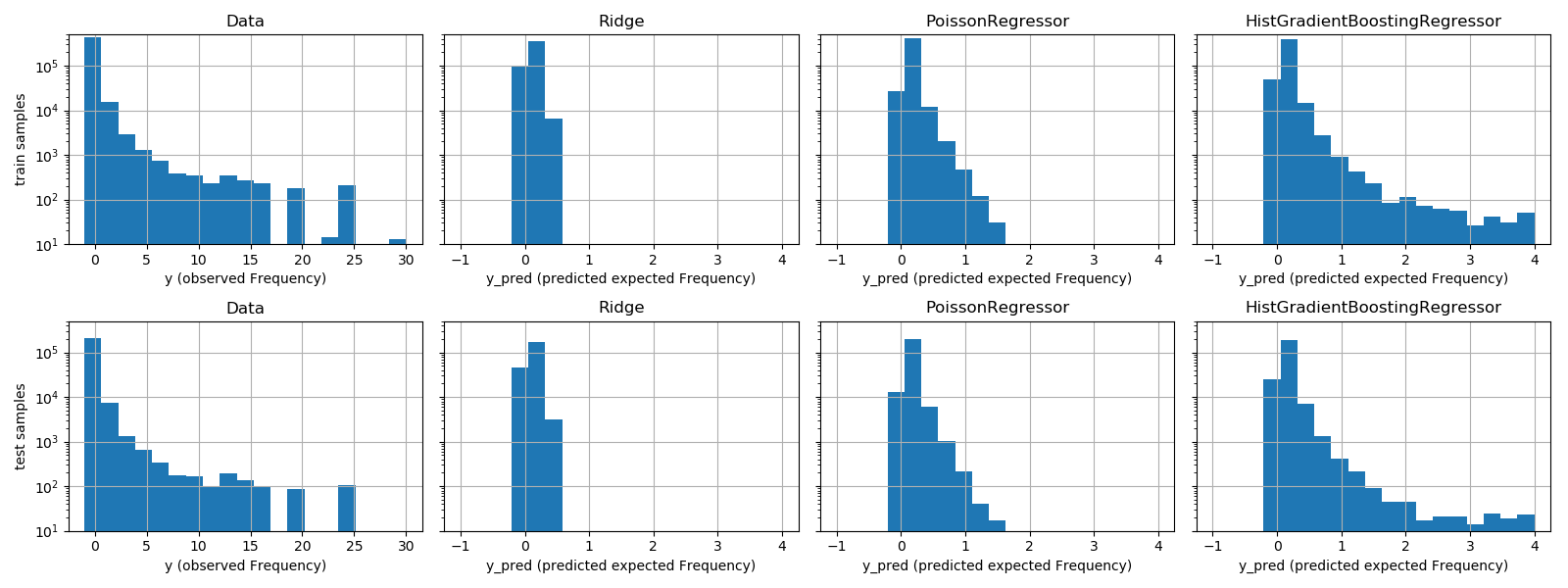 實驗數據給出了
y的長尾分布。在所有模型中,我們都預測了隨機變量的期望頻率,因此,與觀察到的該隨機變量的實現相比,我們的極值必然會更少。這解釋了模型預測直方圖的模式不一定與最小值相對應。另外,Ridge的正態分布具有恒定的方差,而PoissonRegressor和定GradientBoostingRegressor的Poisson分布的方差與預測的期望值成正比。
因此,在所考慮的估計器中,PoissonRegressor和組GRadientBoostingRegressor比Ridge模型更適合于模擬非負數據的長尾分布,而嶺模型對目標變量的分布作了錯誤的假設。
HistGradientBoostingRegressor估計器具有最大的靈活性,能夠預測較高的期望值。
請注意,我們可以對GRadientBoostingRegressor模型使用最小二乘損失。這將錯誤地假設一個正常分布的響應變量,就像Ridge模型一樣,而且可能還會導致輕微的負面預測。然而,由于樹的靈活性,加上大量的訓練樣本,梯度提升樹仍然表現得比較好,特別是比PoissonRegressor更好。
對預測校準的評估
為了保證估計器對不同的投保人類型做出合理的預測,我們可以根據每個模型返回的y_pred來裝箱測試樣本。然后,對于每個箱子,我們比較了預測的y_pred的平均值和平均觀察到的目標得平均值:
from sklearn.utils import gen_even_slices


def _mean_frequency_by_risk_group(y_true, y_pred, sample_weight=None,
                                  n_bins=100):
    """Compare predictions and observations for bins ordered by y_pred.

    We order the samples by ``y_pred`` and split it in bins.
    In each bin the observed mean is compared with the predicted mean.

    Parameters
    ----------
    y_true: array-like of shape (n_samples,)
        Ground truth (correct) target values.
    y_pred: array-like of shape (n_samples,)
        Estimated target values.
    sample_weight : array-like of shape (n_samples,)
        Sample weights.
    n_bins: int
        Number of bins to use.

    Returns
    -------
    bin_centers: ndarray of shape (n_bins,)
        bin centers
    y_true_bin: ndarray of shape (n_bins,)
        average y_pred for each bin
    y_pred_bin: ndarray of shape (n_bins,)
        average y_pred for each bin
    """
    idx_sort = np.argsort(y_pred)
    bin_centers = np.arange(0, 1, 1/n_bins) + 0.5/n_bins
    y_pred_bin = np.zeros(n_bins)
    y_true_bin = np.zeros(n_bins)

    for n, sl in enumerate(gen_even_slices(len(y_true), n_bins)):
        weights = sample_weight[idx_sort][sl]
        y_pred_bin[n] = np.average(
            y_pred[idx_sort][sl], weights=weights
        )
        y_true_bin[n] = np.average(
            y_true[idx_sort][sl],
            weights=weights
        )
    return bin_centers, y_true_bin, y_pred_bin


print(f"Actual number of claims: {df_test['ClaimNb'].sum()}")
fig, ax = plt.subplots(nrows=2, ncols=2, figsize=(12, 8))
plt.subplots_adjust(wspace=0.3)

for axi, model in zip(ax.ravel(), [ridge_glm, poisson_glm, poisson_gbrt,
                                   dummy]):
    y_pred = model.predict(df_test)
    y_true = df_test["Frequency"].values
    exposure = df_test["Exposure"].values
    q, y_true_seg, y_pred_seg = _mean_frequency_by_risk_group(
        y_true, y_pred, sample_weight=exposure, n_bins=10)

    # Name of the model after the estimator used in the last step of the
    # pipeline.
    print(f"Predicted number of claims by {model[-1]}: "
          f"{np.sum(y_pred * exposure):.1f}")

    axi.plot(q, y_pred_seg, marker='x', linestyle="--", label="predictions")
    axi.plot(q, y_true_seg, marker='o', linestyle="--", label="observations")
    axi.set_xlim(0, 1.0)
    axi.set_ylim(0, 0.5)
    axi.set(
        title=model[-1],
        xlabel='Fraction of samples sorted by y_pred',
        ylabel='Mean Frequency (y_pred)'
    )
    axi.legend()
plt.tight_layout()
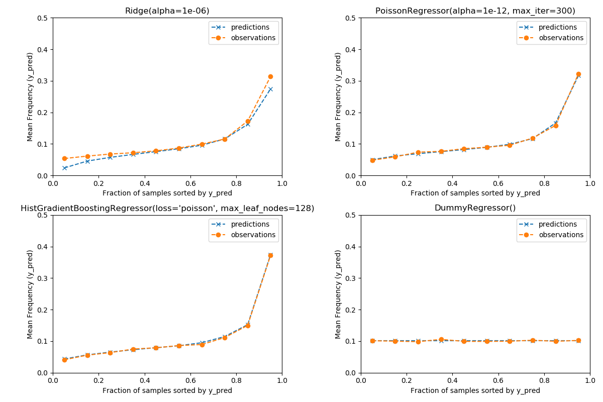
Actual number of claims: 11935.0
Predicted number of claims by Ridge(alpha=1e-06): 10692.9
Predicted number of claims by PoissonRegressor(alpha=1e-12, max_iter=300): 11928.3
Predicted number of claims by HistGradientBoostingRegressor(loss='poisson', max_leaf_nodes=128): 12109.6
Predicted number of claims by DummyRegressor(): 11931.2
虛擬回歸模型預測一個恒定的頻率。這個模型并沒有將所有樣本都歸為相同的約束等級,而是在全部范圍內得到了很好的校準(以估計整個人口的平均頻率)。
嶺回歸模型可以預測與數據不匹配的非常低的期望頻率。因此,這可能會嚴重低估某些投保人的風險。
PoissonRegressor和組織GradientBoostingRegressor在預測目標和觀察目標之間表現出較好的一致性,特別是對于低預測目標值。
所有預測的總和也證實了嶺模型的校準問題:它低估了測試集中索賠總數的3%以上,而其他三種模型可以大致恢復測試組合的索賠總數。
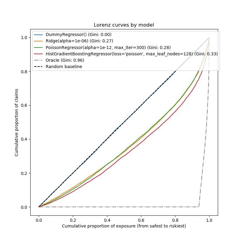
排名權的評估
對于某些業務應用,我們感興趣的是,無論預測的絕對值如何,模型是否能夠從最安全的投保人中對風險進行排序。在這種情況下,模型評估會將問題描述為排序問題,而不是回歸問題。
為了從這個角度比較這三個模型,我們可以根據模型的預測,從最安全到最危險的模型預測,繪制索賠的累積比例與測試樣本順序的累積暴露比例。
這幅圖被稱為Lorenz曲線,可以用基尼指數來概括:
from sklearn.metrics import auc


def lorenz_curve(y_true, y_pred, exposure):
    y_true, y_pred = np.asarray(y_true), np.asarray(y_pred)
    exposure = np.asarray(exposure)

    # order samples by increasing predicted risk:
    ranking = np.argsort(y_pred)
    ranked_exposure = exposure[ranking]
    ranked_frequencies = y_true[ranking]
    ranked_exposure = exposure[ranking]
    cumulated_claims = np.cumsum(ranked_frequencies * ranked_exposure)
    cumulated_claims /= cumulated_claims[-1]
    cumulated_exposure = np.cumsum(ranked_exposure)
    cumulated_exposure /= cumulated_exposure[-1]
    return cumulated_exposure, cumulated_claims


fig, ax = plt.subplots(figsize=(8, 8))

for model in [dummy, ridge_glm, poisson_glm, poisson_gbrt]:
    y_pred = model.predict(df_test)
    cum_exposure, cum_claims = lorenz_curve(df_test["Frequency"], y_pred,
                                            df_test["Exposure"])
    gini = 1 - 2 * auc(cum_exposure, cum_claims)
    label = "{} (Gini: {:.2f})".format(model[-1], gini)
    ax.plot(cum_exposure, cum_claims, linestyle="-", label=label)

# Oracle model: y_pred == y_test
cum_exposure, cum_claims = lorenz_curve(df_test["Frequency"],
                                        df_test["Frequency"],
                                        df_test["Exposure"])
gini = 1 - 2 * auc(cum_exposure, cum_claims)
label = "Oracle (Gini: {:.2f})".format(gini)
ax.plot(cum_exposure, cum_claims, linestyle="-.", color="gray", label=label)

# Random Baseline
ax.plot([0, 1], [0, 1], linestyle="--", color="black",
        label="Random baseline")
ax.set(
    title="Lorenz curves by model",
    xlabel='Cumulative proportion of exposure (from safest to riskiest)',
    ylabel='Cumulative proportion of claims'
)
ax.legend(loc="upper left")
<matplotlib.legend.Legend object at 0x7f96079cbc10>
正如預期的那樣,虛擬回歸者無法正確地對樣本進行排序,因此在此圖上執行最糟糕的操作。
基于樹的模型在按風險對投保人排序方面有明顯的優勢,而兩個線性模型的表現類似。
這三種模型都明顯優于偶然性,但也遠未做出完美的預測。
由于問題的性質,預計這最后一點:事故的發生主要是間接原因,數據集中的列中沒有捕捉到這些原因,而且確實可以認為是純粹的隨機因素。
線性模型假定輸入變量之間不存在交互作用,這可能導致擬合不足。插入多項式特征提取器(PolynomialFeatures)確實使它們的描述能力增加了2點的基尼指數。特別是,它提高了模型識別前5%風險最大形象的能力。
Main takeaways
這些模型的性能可以通過它們能夠做出精確的預測和良好的排名來評估。 該模型的標定可以通過被預測風險組合的測試樣本的平均觀測值和平均預測值來評估。 嶺回歸模型的最小二乘損失(以及識別鏈接函數的隱式使用)似乎導致該模型被嚴重校準。特別是,它往往低估風險,甚至可以預測無效的負頻率。 使用帶對數鏈的泊松損失可以糾正這些問題,并形成一個校正良好的線性模型。 基尼指數反映了一個模型無論其絕對值如何對預測進行排序的能力,因此只評估它們的排序能力。 盡管在校準方面有所改進,但兩種線性模型的排序能力是相當的,并且遠低于梯度提升回歸樹的排能力。 作為評價指標計算的泊松偏差既反映了模型的校準能力,又反映了模型的排序能力。它還對響應變量的期望值與方差之間的理想關系作了線性假設。為了簡潔起見,我們沒有檢查這個假設是否成立。 傳統的回歸度量,如均方誤差和平均絕對誤差,很難對有很多0的計數值進行有意義的解釋。
plt.show()
腳本的總運行時間:(1分0.675秒)
Download Python source code:plot_poisson_regression_non_normal_loss.py
Download Jupyter notebook:plot_poisson_regression_non_normal_loss.ipynb